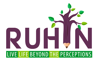
Logo is complete in itself and expands to our five fundamental principles
REDEFINE
UPLIFT
HEAL
INSPIRE
NURTURE
Etymolgy
The word RUHIN finds the roots in Hindi and Sanskrit and can be found in almost all the Indo-European, Dravidian and other language families. It means & Spiritual, Sacred & Divine’.And this absolutely justifies our vision.
Epigram
Live Life Beyond The Perceptions.
Because… The life must be lived meaningfully and with realization of the higher self and to transcend the existence. The word ‘perception’ means ‘awareness of all the senses’, ‘response to the stimuli’ and ‘profound understanding of everything’.
The Concise Summary
A pencil as the foundation that crafts the destinies ‘sowing the seeds’ transcending upwards to a tree that is growing with the branches thriving in all directions ‘shaping the future fruits to reap’
Purple: Heart and Soul
‘Redefine’, ‘Inspire’, ‘Uplift’. The three out of five fundamental principles belong to the colour PURPLE. The purple signifies spirituality, wisdom, imagination. It stimulates our innermost self awareness. Enlightens our consciousness and provides wisdom. Encourages ‘Compassion’ and ‘Creativity’… the two of our five ‘C’s.
Green: Mind and Body
The alternative shades of GREEN symbolize the other two principles- ‘Heal’ and ‘Nurture’. The green is growth, prosperity and generosity. It feels relaxing and revitalizes our body and mind , balances our emotions and bestows us with hope and health to feel ‘Confident’, safe and secure because we ‘Care’ and ‘Cheer’ for you with rest of the three ‘C’s. In harmony and absolutely well tuned with nature is the idea.
The combination
The passion of purple blends with generosity of green, together they balance the logic and emotions. Green serves as the base, a strong foundation as in the nature with green grass rooted on the ground while flourishing high in the immense scope for powerful imagination of purple…
The purple is formed by combining two primary colours: Blue and Red.
The green is formed by combining two primary colours: Blue and Yellow.
Moreover, the contrasting colour combination renders it a colour blind friendly characteristic making it even more inclusive and accessible to diverse audience.